Neocities.org

Neon rust n' alien dust!
325,799 views
801 followers
3,507 updates
0 tips
Alright, it's important question time: how do you see the font of my site on the browsers you use? Cause I'm starting to think Edge messes with the way it renders... and yes, I use Edge for all the coding work :'/
Neon rust n' alien dust! was updated.
1 year ago
5 likes
 ninacti0n
1 year ago
ninacti0n
1 year ago
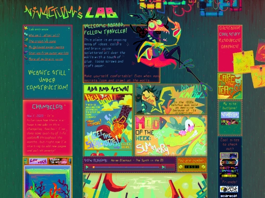
Alright, I think I managed to fix the grid system of my homepage for good now :'] I did the same strategy I'm using for my about page, in which those wide column gaps are actually the left margins of the divs! I had to make the gaps smaller so that the middle part would behave properly. Phew!
1 like
ninacti0n
1 year ago
Also... I'll fix a bunch of things I'm not happy with in my about page, and might release it tomorrow or the day after it- but it's still a bit uncertain.
1 like
*Clips out of wall* I'M NOT DEAD GUYS- I just sank into an Aggie with my DA folks for the past week :'D Hanging out with friends and drawing with them is always some crazy fun ^^ I'll return development in my about page and give it the finishing touches very soon! I'm also taking a lil' break at the end of October, so that I can return at my best ;]
5 likes
After lots of work, I'm happy to say I'm almost done with my about page! I managed to build a fun layout, explore the color palette and even ended up finding a winamp skin that fit the aesthetic like a glove! And let's not forget the assets! I still have some to make, but a large chunk is already done ^^
11 likes
omg you site looks so good??!!?!!! the aesthetic! the font!!! i love your drawings :D
2 likes
ninacti0n
1 year ago
Eee, thank you SO MUCH!! I'm flattered you enjoyed it that much- :'] Also, I'm sorry for not replying too fast, I've been busy working on a new page :P
1 like
I'm trying to add a winamp to my about page with some OST tracks I like, but I can't seem to get it to work. To any of you who managed to do it, is it possible for me to do it with Google Drive as a file host for the tracks or not? :7
4 likes
 cinnamuff
1 year ago
cinnamuff
1 year ago
I've heard of users using Catbox to host their files, try that maybe? I haven't used it myself yet though. 😅
3 likes
ninacti0n
1 year ago
Hm, I've tried using Catbox once, but it was out of order :P I'll give it another go and see if the hosting works though-
2 likes
2 likes
2 likes
I did something superb today- when I was surfing on some websites I follow, I found a really interesting dithering tool! Its name is "dither me this", and thanks to it, I managed to reduce the size of all my background textures, so everything loads faster now! ^^ Huge thanks to Roska (webmaster of Vaje) for adding that little gem in her links tab! :]
6 likes
ninacti0n
1 year ago
And btw, if you're into weirdcore/dreamcore or bright colors, do check her site out! It's pretty twisted n' cool with the aesthetics and web design she went for, plus her Roblox games are very intriguing!
2 likes
 voodu
1 year ago
voodu
1 year ago
You may or may not already know of this, but I thought I'd share it anyways: https://gyng.github.io/ditherer/ This is another cool dithering tool worth checking out!
1 like
ninacti0n
1 year ago
Ooh, I didn't hear about this tool until now actually! Thanks for sharing it Voodu, I'll check it out! :D
1 like
Neon rust n' alien dust! was updated.
1 year ago
5 likes
ninacti0n
1 year ago
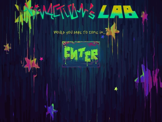
After a whole bunch of media query work, I think my ENTER page is fully mobile friendly now! Still not optimized for tablets, but should work well on handheld devices that sit around 500-600 px :P
1 like
ninacti0n
1 year ago
I had to work it out particularly because it was broken on mobile, since my ENTER button has a particular margin set to it. Now, I'm sure it looks good and works well!
1 like
Well, dang- I accidentally deleted my update post with my silly hand :'D I finished animating one of my pagedolls for my site, and added it at the bottom of my index page, right in between the neighborhoods/webrings columns! But gosh, talk about a simple animation that ended up being a pain in the butt to render properly... but I'm glad I managed to make it work! ⚡
9 likes
ninacti0n
1 year ago
And btw- nope, this isn't that one pagedoll of my sona that I mentioned a handful of posts ago. That one has actually more than 50 different frames... and I hope to finish it soon :']
3 likes
ninacti0n
1 year ago
And lastly... I'm SUPER excited to finish up my about page and post it here! I even edited a whole bunch of pictures I took myself to add in it-
3 likes
Heya there! I just stumbled upon your page through someone's button collection, and must say: your page is the embodiment of virtual chaos lol! Everything is so energetic and vibrant while having the vibes of a compact online corner, plus you've got an interesting art and coloring style there :] Keep up the funky n' fun coding work!
5 likes


just looked through most of your webpages and i can read the font just fine. the font on your "about" page even sits on the notebook lines pretty well.
If it's the case, I might switch browsers to make sure I see the font in a proper way to fix the spacing n' stuff- I was already suspecting that something looked weird, since all my letters look more cramped than they should xD
@Layang Ok, that's good! How do you see it? Is it clear or chunky?
oh yeah i use firefox, and i'd say that most of the font is pretty widely spaced (except for the about page which is more "normally" spaced). also, kudos for using edge lol.
the font is clear for me on both my monitors, like the edges aren't fuzzy. i have both a 15" (1536 × 731) and 24" (1920 × 947) screen.
Oh, how nice to hear! You're seeing it as intended then. Thanks for the feedback, Layang! ^^ I chose to use Edge because it's lightweight and I'm already used to the devtools, but if it's necessary, I'm up to change!
no judgement! i actually just switched from chrome to firefox and the adjustment definitely throws me off sometimes. i think it's better for people to just use what's familiar to them, esp for something that's just a fun lil personal project <3
Here's how I see my font on edge: https://files.catbox.moe/q946gm.png It was supposed to look different than this, but it's how I see it :P
Also yes, I agree with you- I'll stick to what I'm used to working with, but if the difference is way too conflicting (even on mobile it looks better lol), I'll do what I can! :] Let's hope for the best!
wait...that's how i see the font...is that not right??? lmao omg, have i been giving you the wrong info?? here's a screenshot from me: https://i.imgur.com/sDkfX4Q.png
another screenshot: https://i.imgur.com/DFGtmiC.png
Huh?? Ok, now I'm a bit confused xD It seems the way the font is being rendered isn't right for some reason lol. I gotta investigate >:T