Neocities.org


Does anyone else have a site that feels held together by candy floss. Just tried to do a quick edit and nuked my site. HTML gods save my soul
6 likes

1 like
 asterion
4 months ago
asterion
4 months ago
If you don't do this already, before you make any edits, save the webpage in question. If you make any edit that significantly alters the site adversely (and you can't remember how to 'back out of it'), you can simply go back to an earlier save.
1 like
my #1 goal for neocities is to get linked as one of the many people on neonaut's site
6 likes

1 like
1 like

1 like

1 like
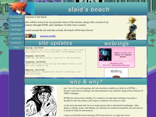
does anyone like the Dark Aero aethestic for my writings page? I'm gonna be working (and hopefully finishing) it today but idk if the aethestic feels weird or not compared to the rest of my site
1 like
asterion
4 months ago
It does contrast in comparisons with the backgrounds of other pages. Unless the writings themselves are going to be 'dark' to match the background, perhaps start with a background more in line with the backgrounds of your other pages.
1 like
asterion
4 months ago
BTW, your site has given me a very nice idea for a section of my own site. Thank you.
1 like
 slaid
4 months ago
slaid
4 months ago
fair enough, I'll probably change it around and see what I like. thank you for the feedback! and also very glad I could inspire a section
shit is fucking awesome
2 likes
ALRIGHT I have a few days of break. it's time to start working on the site again
3 likes
very happy to see a bunch of my mutuals either featured or in the neighbors section of federiefederi’s site. congrats to you all!!
3 likes


worked on my shrine page and completed my first shrine! I'll update the choso shrine as time goes and the header on the shrines page is placeholder but I'm really happy about how it all turned out
DO tell me if the choso shrine page looks ugly though. I spent like 2 hours on it and honestly I'm not sure how I feel yet
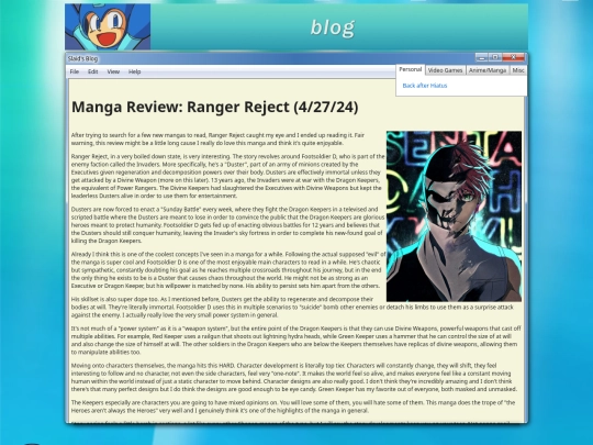
In Firefox browser, the B&W characters look as though they should be more to the left than they are. The B&W character on the left is blocking the main frame (the one in red). I don't have access to Chrome or M$ browsers at the moment.